 wehub-resource-sync
7.1 KiB
7.1 KiB
Note
本文档由 WeHub 基于上游 README 翻译整理,属于社区翻译,非官方中文文档。
English · 原始项目 · 上游 README
原作者、版权与许可证归属以原始项目及本仓库 LICENSE 文件为准。
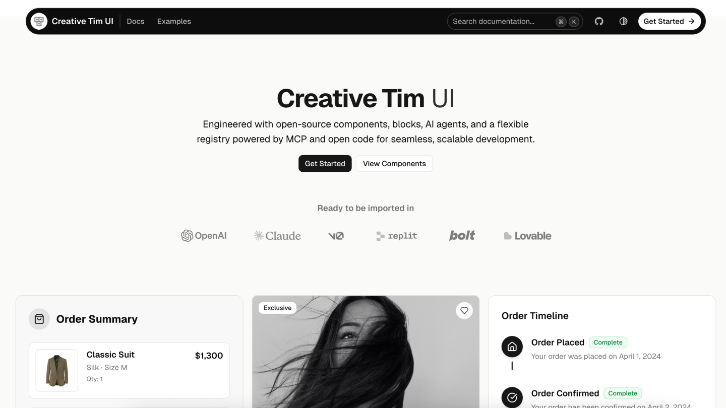
Creative Tim UI
Creative Tim UI 是一个基于 shadcn/ui 构建的综合性组件库,可帮助你更快地开发现代 Web 应用。
概述
Creative Tim UI 提供预构建、可定制的 React 组件与区块,专为构建美观且可用于生产环境的 Web 应用而设计。 CLI 可让你轻松将这些组件添加到你的 Next.js 项目中。
安装
你可以直接使用 npx 运行 Creative Tim UI CLI,或进行全局安装:
# Use directly (recommended)
npx @creative-tim/ui@latest add <component-name>

# Or using shadcn cli
npx shadcn@latest add https://creative-tim.com/ui/r/all.json
前置要求
在使用 Creative Tim UI 之前,请确保你的 Next.js 项目满足以下要求:
- Node.js 18 或更高版本
- 项目中已初始化 shadcn/ui(npx shadcn@latest init)
- 已配置 Tailwind CSS
使用
安装全部组件
一次性安装所有可用的 Creative Tim UI 组件:
npx @creative-tim/ui@latest add all
该命令将:
- 若尚未配置,则设置 shadcn/ui
- 将所有 Creative Tim UI 组件安装到你配置的组件目录
- 向项目添加必要的依赖
安装指定组件
使用 components add 命令安装单个组件:
npx @creative-tim/ui@latest add <component-name>
示例:
# Install the orb component
npx @creative-tim/ui@latest add card
备选方案:使用 shadcn CLI
你也可以使用标准的 shadcn/ui CLI 安装组件:
# Install all components
npx shadcn@latest add https://creative-tim.com/ui/r/all.json

# Install a specific component
npx shadcn@latest add https://creative-tim.com/ui/r/button.json
所有可用组件可在此处 查看,也可在此处. 浏览示例区块列表。
区块
浏览我们按类别整理的即用型区块集合。每个区块均可完全自定义,并可通过一条命令添加到你的项目中。
应用 UI
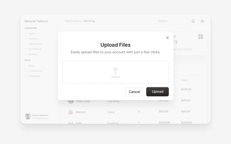
Modals 5 Blocks |
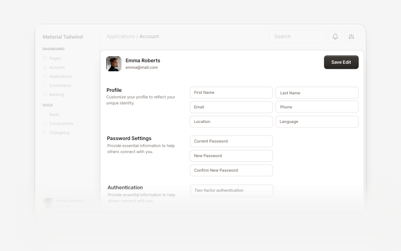
Account 7 Blocks |
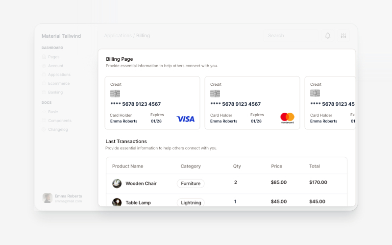
Billing 5 Blocks |
营销
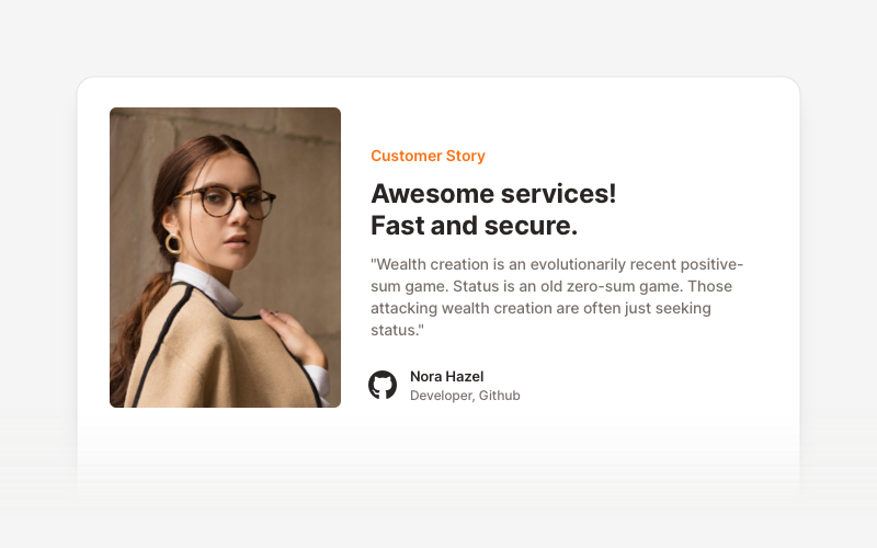
Testimonial Sections 17 Blocks |
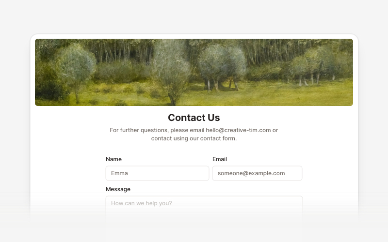
Contact Sections 15 Blocks |
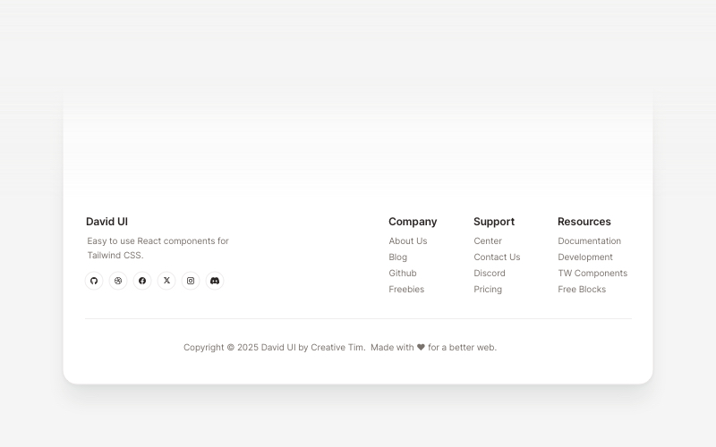
Footers 16 Blocks |
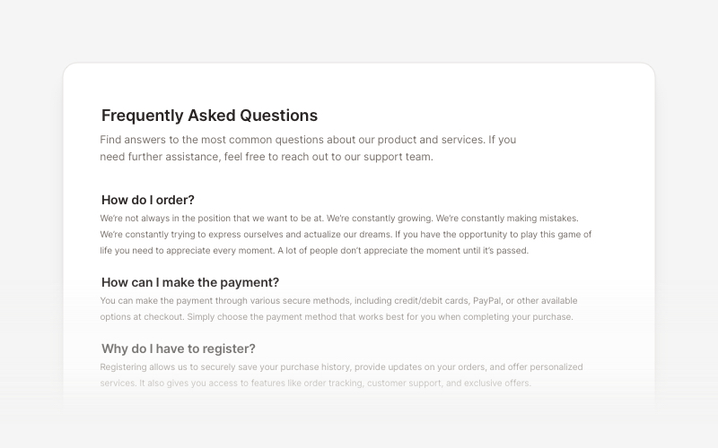
FAQs 6 Blocks |
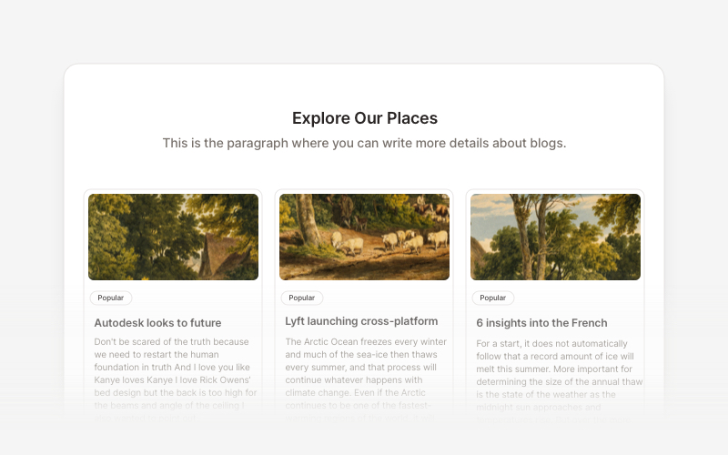
Blog 15 Blocks |
电商 UI
适用于产品列表、购物车和结账流程的即用型区块。
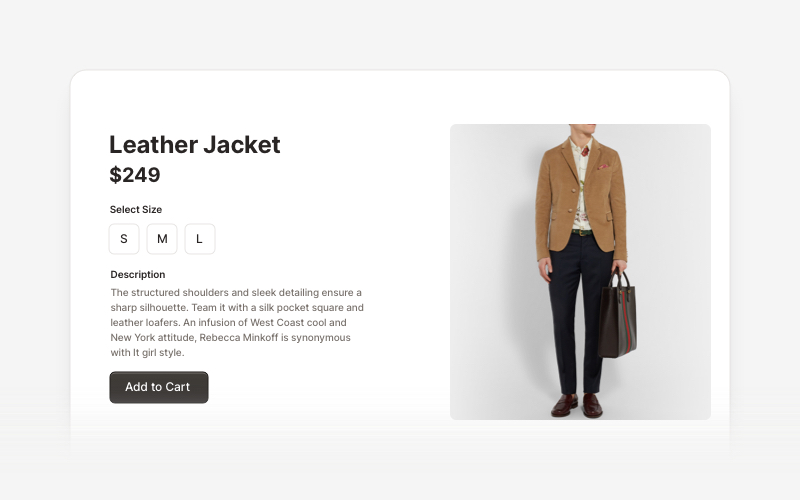
Ecommerce Sections 14 Blocks |
Web 3.0
为去中心化应用、区块链项目和加密货币平台打造的创新区块。
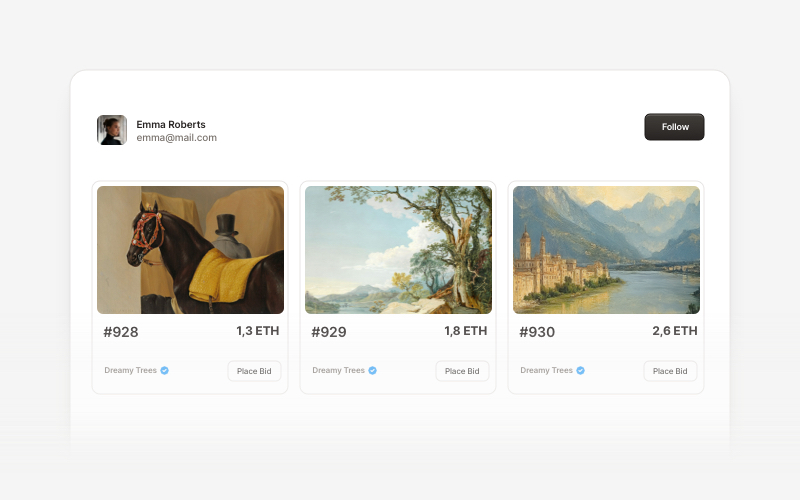
Web 3.0 Cards 5 Blocks |
贡献
如果你想为 Creative Tim UI 做出贡献,请按以下步骤操作:
- Fork 该仓库
- 创建新分支
- 在 registry 中修改组件。
- 向 main 分支提交 PR。
请阅读贡献指南。
版权与许可
Creative Tim UI 建立在开源社区卓越工作的基础之上:
- shadcn/ui - 文档结构、registry 系统以及基础(原子)组件均来自 shadcn/ui 的开源工作。MIT License
- Material Tailwind by Creative Tim - 区块与组件设计受 Material Tailwind Framework 启发并以其为基础。MIT License
- Eleven Labs UI - 文档结构与区块设计思路的总体灵感来源。MIT License
- Geist Font by Vercel - 界面中使用的优美字体。SIL Open Font License 1.1
我们感谢这些项目在开源许可下公开其工作成果。
许可证
根据 MIT license. 授权。
由 Creative Tim. 倾心打造